Modern Website Design Trends
Put your best foot forward online.
As humans, we have many good and bad qualities, but one thing we excel at is the ability to make rapid judgments. In fact, studies suggest that it takes merely a fraction of a second—about 50 milliseconds or 0.05 seconds—for individuals to form an impression of a website. (This has been confirmed by Google research). This initial perception significantly influences our decision to either engage further or navigate away. Just as we evaluate people at lightning speed, the same principle applies to websites online.
And these impressions matter. Research has proven that the better the first impression, the longer a visitor will stay on a page. So, what makes up that first impression? A British study showed that 94% of initial opinions were design-related, and only 6% content related. (We’re not just saying this because we design websites, honestly!) It is absolutely essential to your business’s success to present a well-designed website.
But what makes a design appealing? The most important guideline that research provides us is to follow current conventions. It is true our behavior adapts quickly to new technology (e.g. new iPhones, new operating systems) and these new technologies create new standards (e.g. a mobile menu, or a scroll wheel), but we don’t like to continually be in a state of change. Simplify your web design and stick to familiar conventions. Users typically have preconceived notions of how an e-commerce site should appear. Departing from traditional layouts with innovative designs may lead to decreased user acceptance.
With that said, let’s look at some best practices in modern design.
Dense & Rich Graphics
The first trend we’ll discuss is the use of and reliance on dense and rich graphics. The shift towards dense and rich graphics represents a departure from the minimalist approach and an embrace of what we might term maximalism.
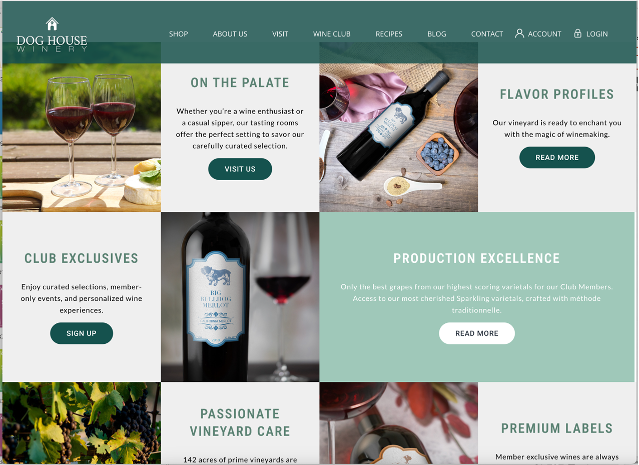
Traditionally, minimalism has been celebrated for its simplicity and clarity. However, in recent times, we have observed a growing inclination towards complexity and richness in visual design. This trend is marked by a profusion of color, intricate details, and multi-layered content that captivates the viewer’s attention.
Research indicates that a desire for engagement and immersion drives this shift. In a world inundated with information, dense graphics offer a way to stand out and command attention. Studies by psychologists such as Dr. Richard Mayer have shown that multimedia presentations with rich visuals are more effective in enhancing learning and retention compared to simpler formats.
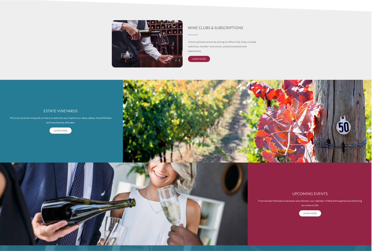
One notable aspect of this trend is the limitless possibility and diversity it offers. From vibrant illustrations to intricate patterns, designers are exploring a myriad of creative expressions. This diversity reflects the richness of human imagination and caters to a wide range of preferences and tastes.
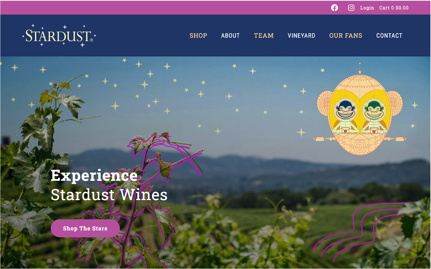
Moreover, dense graphics serve as a form of artistic expression, allowing individuals and brands to convey their unique personalities and styles. Just as a painting or sculpture reflects the artist’s vision, visual content communicates the essence of its creator. This personal touch fosters a deeper connection with the audience, leading to increased engagement and brand loyalty.
Illustration
A significant trend that’s been reshaping the digital landscape is the increased use of illustration in web design and digital art. In recent years, we’ve witnessed a notable surge in the incorporation of illustrations and patterns across various digital platforms. This trend represents a departure from traditional design elements and a shift towards a more personalized and engaging visual experience.
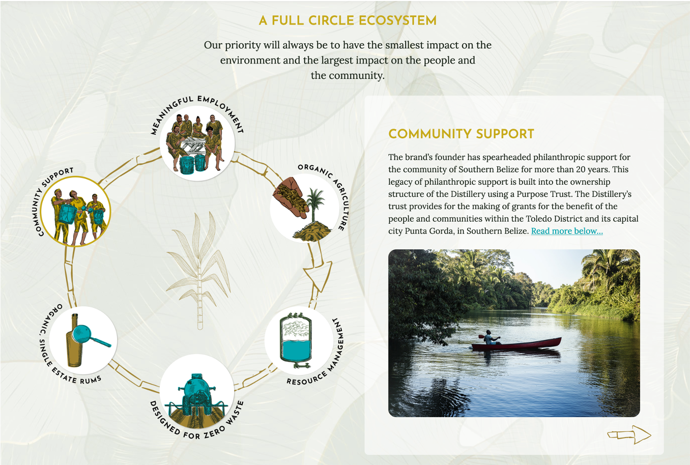
Research conducted by design experts such as Elizabeth C. Miller has shown that incorporating illustrations into web design can significantly enhance user engagement and retention. Unlike stock photos or generic graphics, illustrations offer a unique and personalized look and feel, capturing the attention of users, and inviting them to explore further.
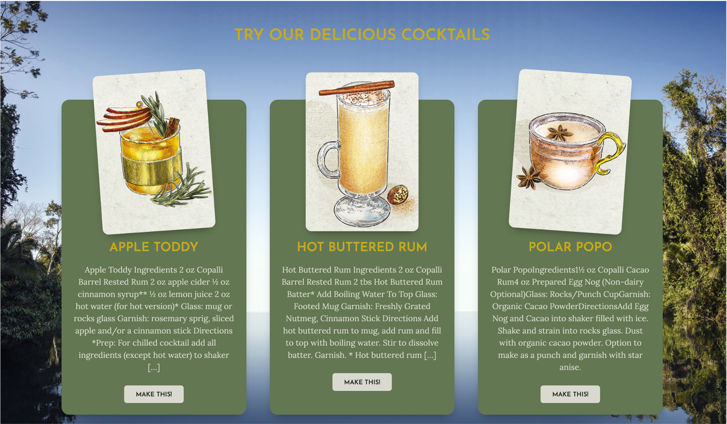
One of the key advantages of using illustrations is their ability to convey emotion and personality. In a digital world, often characterized by sterile and impersonal interfaces, illustrations inject a sense of humanity and authenticity. Studies by psychologists have demonstrated the profound impact of visual cues on emotional response, highlighting the importance of design elements that evoke genuine feelings.
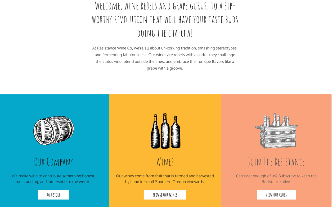
Moreover, illustrations have a whimsical quality that adds a playful and dynamic dimension to digital content. Whether it’s a quirky character or a vibrant pattern, illustrations create a sense of joy and spontaneity that resonates with users on a deeper level. This whimsical nature fosters an emotional connection between the audience and the content, leading to increased engagement and brand loyalty.
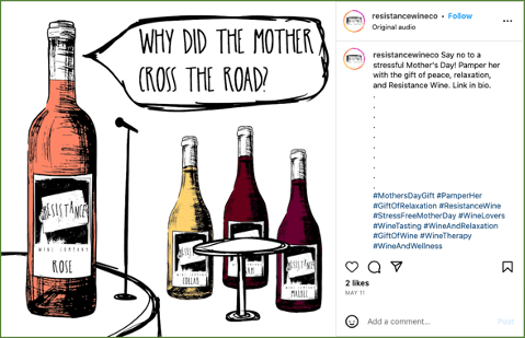
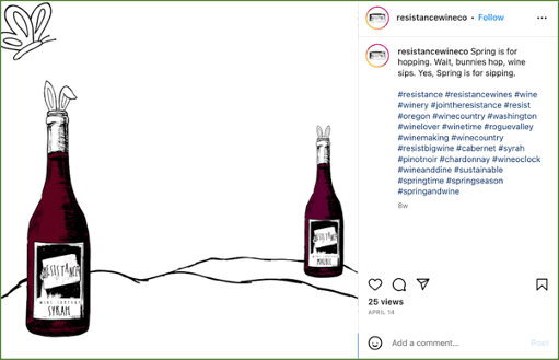
The increased use of illustration in web design and digital art is more than just a stylistic choice; it’s a means of creating a more human and genuine online experience. By infusing digital content with personalized illustrations and patterns, we can forge deeper connections with our audience and foster meaningful engagement.
Parallax Scrolling
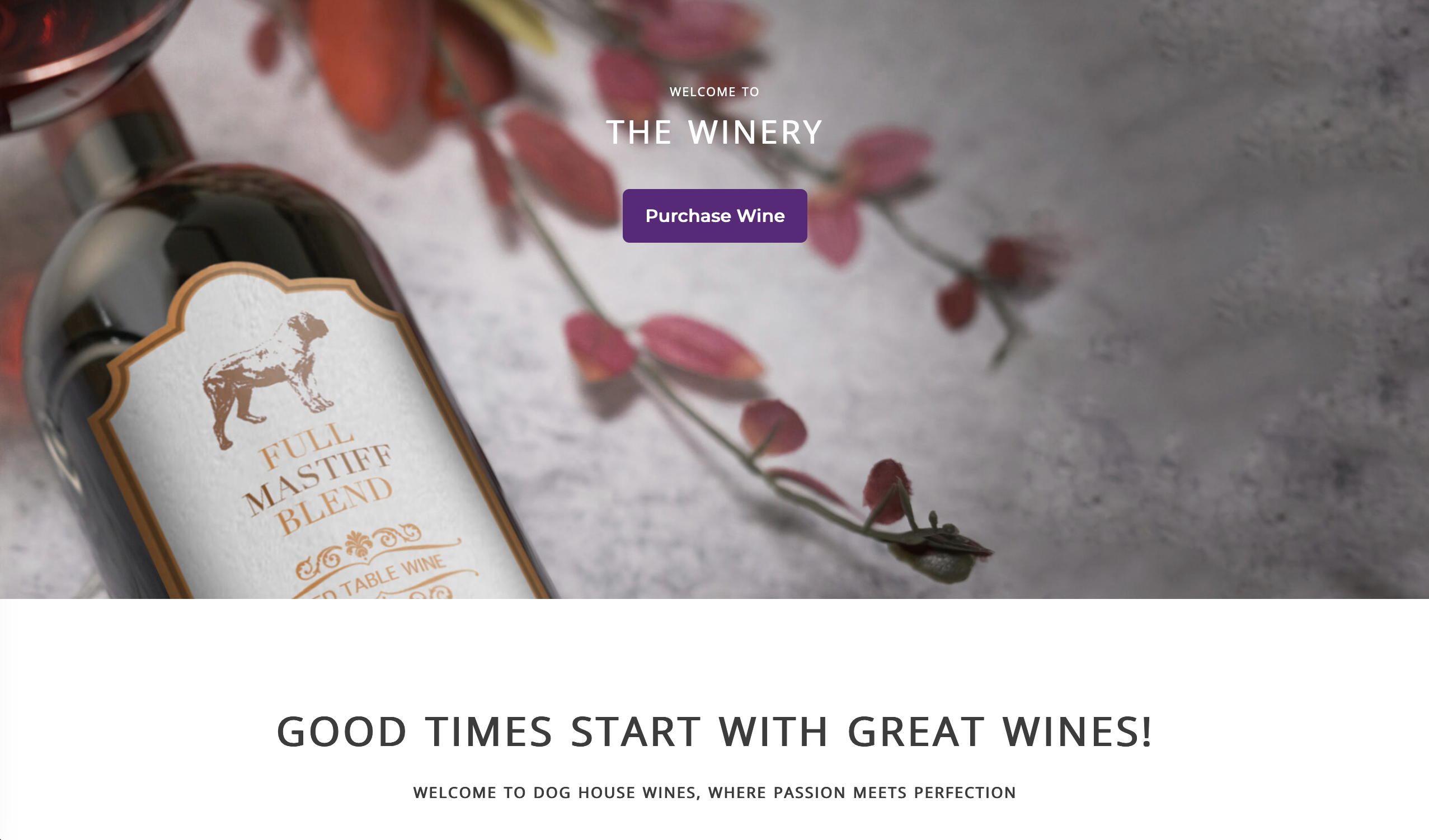
Parallax scrolling is a dynamic design technique where background content moves at a different speed than foreground content as the user scrolls through the webpage. Do you notice how this blog moves with you and slides in paragraphs and images as you scroll down the page? That’s parallax scrolling! This creates a captivating sense of depth and immersion, enhancing the overall user experience.
Research in user interface design has demonstrated the effectiveness of parallax scrolling in engaging and retaining users’ attention. By adding a layer of interactivity and visual interest, parallax scrolling encourages users to explore and interact with digital content in a more meaningful way.
One of the key benefits of parallax scrolling is its ability to create a storytelling experience. Just like flipping through the pages of a book, users are guided through a narrative journey as they scroll down a webpage. This sequential unfolding of content not only captures the user’s interest but also allows for the delivery of information in a more structured and memorable manner.
Evolution of Typography
We can’t talk about trends if we don’t explore the fascinating evolution of typography and how it’s shaping the visual landscape of design.
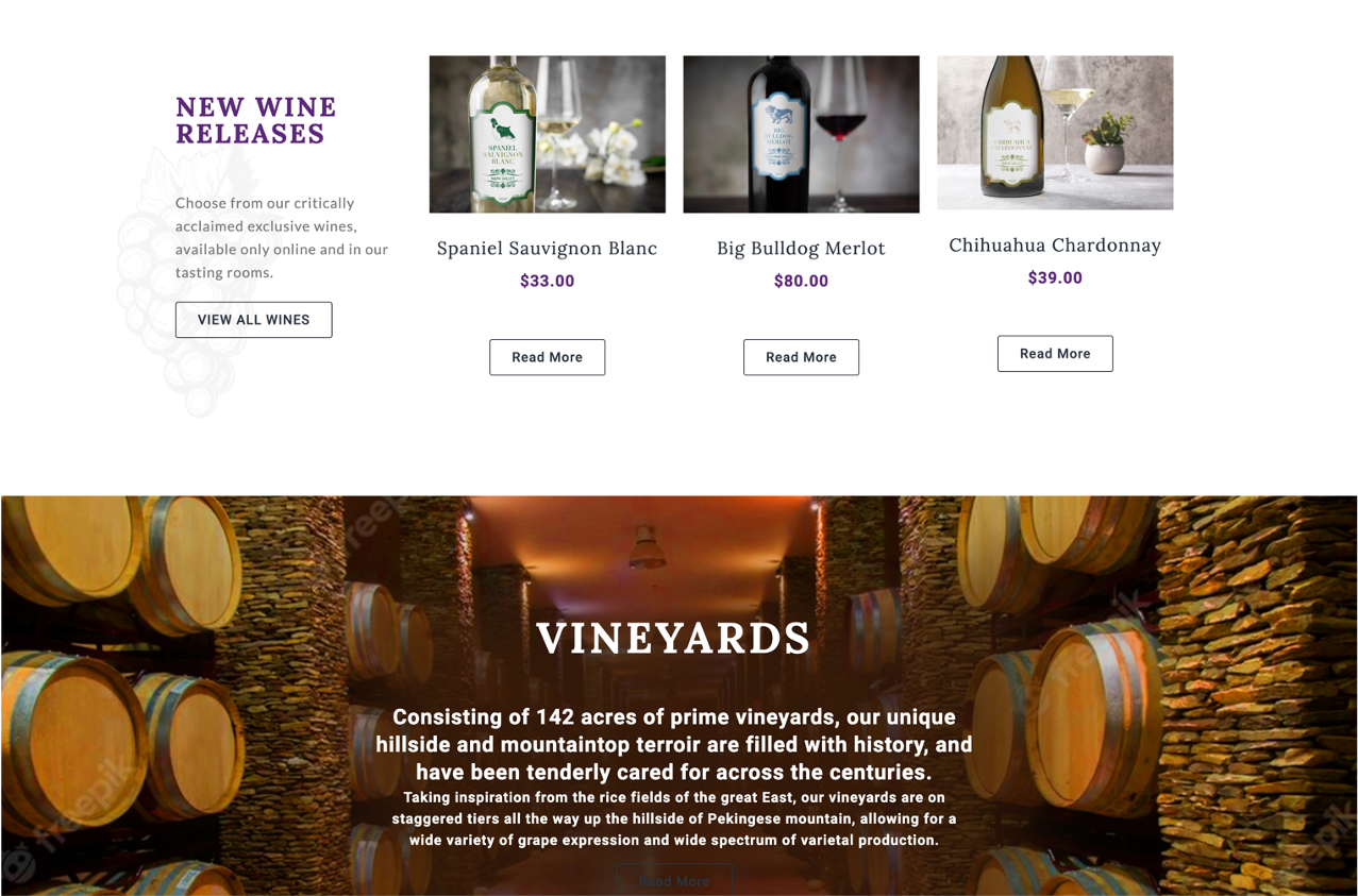
Typography, the art, and technique of arranging type, has undergone a remarkable transformation in recent years. We’re witnessing a shift towards bolder, more opinionated use of fonts, where text treatment serves as a statement of identity rather than just a means of communication.

Research conducted by typographic experts highlights the profound impact of typography on brand perception and user experience. In today’s digital age, where attention spans are increasingly fragmented, typography plays a crucial role in capturing and retaining audience attention. By choosing fonts that are bold and expressive, designers can create a distinct visual identity that resonates with their target audience.
One of the key trends in the evolution of typography is the use of larger text sizes. This shift is driven by the need to accommodate various screen sizes and devices, ensuring that text remains legible and impactful across different platforms. Studies have shown that larger text sizes not only improve readability but also enhance user engagement, leading to higher conversion rates and customer satisfaction.
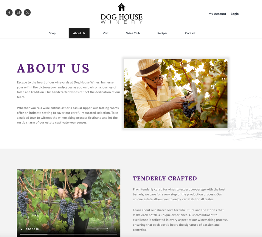
Furthermore, designers are embracing white space as a strategic design element to make the message ring clear. Also known as negative space, white space refers to the empty areas surrounding elements of a design. By judiciously incorporating white space, designers can create visual balance and emphasis, allowing the text to breathe and stand out against the background.
Full-Height Home page Hero Images
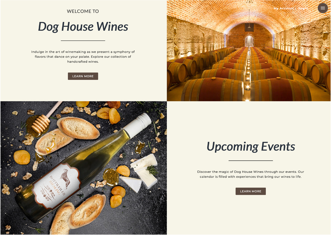
Imagine your website’s homepage as a giant billboard or a beautifully crafted greeting card, welcoming visitors with a stunning visual experience. That’s precisely the effect full-height hero images aim to achieve. By occupying the entire screen, these images command attention and set the tone for the rest of the website.
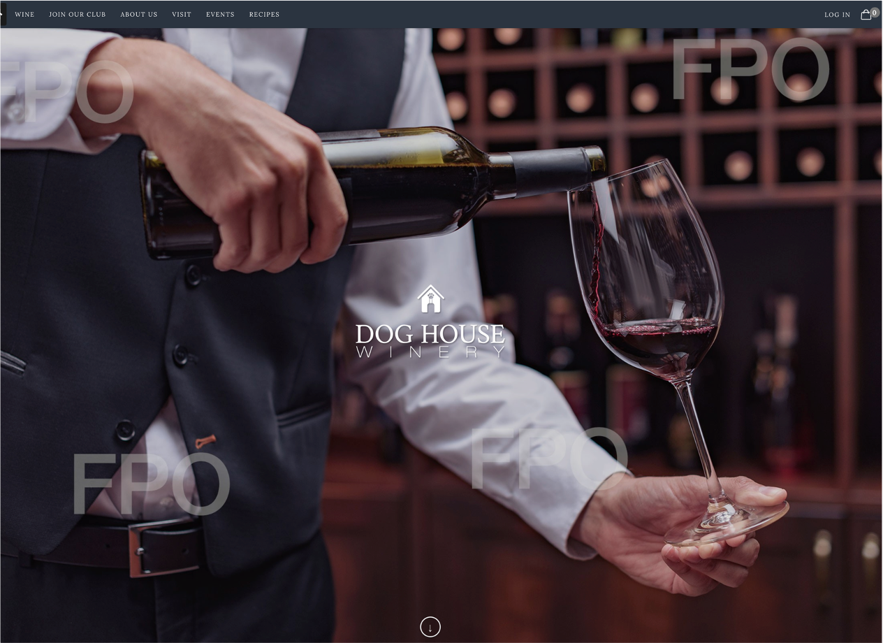
Research in user experience design has shown that full-height hero images can create a distraction-free focus for users. By eliminating clutter and unnecessary elements, designers can direct users’ attention towards the most important content, whether it’s a call-to-action button or a key message.
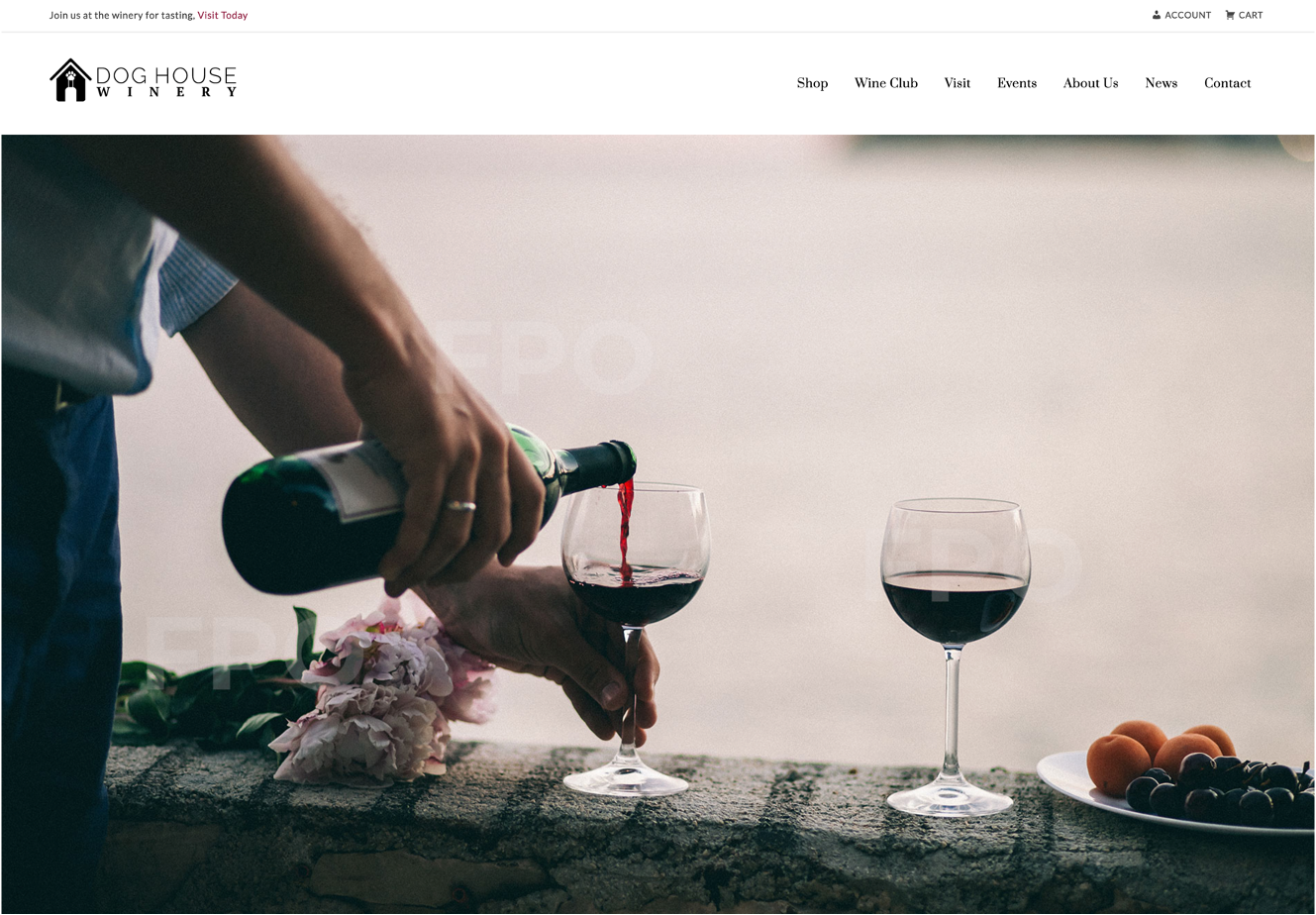
One of the key advantages of full-height hero images is the opportunity they provide for storytelling. Just like the cover of a book, the hero image sets the stage for the narrative that follows. Whether it’s showcasing a product in action or highlighting a brand’s values and mission, the hero image serves as a powerful visual storyteller, capturing the imagination of visitors and inviting them to explore further.
When selecting a hero image, it’s essential to choose one that works seamlessly across different browser sizes and devices. With the proliferation of smartphones and tablets, users access websites on a wide range of screens, from large desktop monitors to small mobile screens. Research emphasizes the importance of this, as users are more likely to engage with websites that offer a seamless experience across devices.

Gone are the days of worrying about the content being “above the fold”. With the rise of scrolling behavior and the ubiquity of touch screens, users are accustomed to navigating through content vertically. Research by Stanford suggests that users are willing to scroll for relevant and engaging content, debunking the myth of the fold as a barrier to engagement.
AI in Design
Finally, we couldn’t have a blog in 2024 and not talk about AI. AI is especially helpful with templates because templates typically have set orientations for their images. The biggest disappointment we see, is clients falling in love with a template and then not having the images to match it. Remember that the template only looks that good because a designer chose those images to go in it.
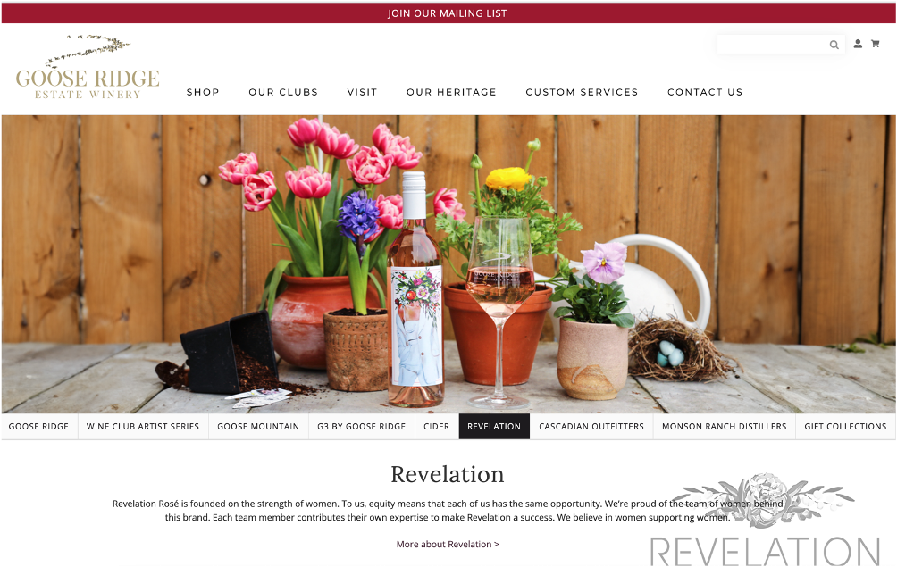


AI is particularly helpful in extending backgrounds or removing elements from photos that would have taken many painful hours in Photoshop. Here are some examples from a website we were building for GooseRidge on WineDirect. They required these very long horizontal images that were tough to find, so we used AI on almost all of the bottle shots to extend the sides so the image would work in the layout.
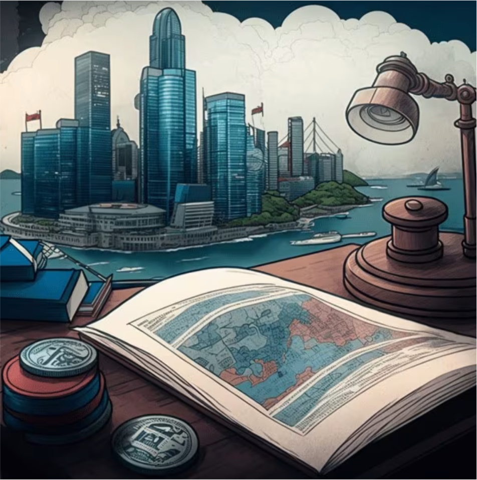
AI has emerged as a game-changer in the realm of graphic design by enabling the creation of custom graphics from text prompts. AI-powered platforms can interpret textual descriptions and transform them into visually stunning graphics. This technology offers immense benefits for designers and businesses alike, as it streamlines the creative process, reduces time and costs associated with manual design tasks, and enables the rapid generation of personalized visual content. Whether it’s generating social media graphics, designing marketing materials, or creating infographics for a website, AI-driven solutions provide designers with a powerful tool to bring their ideas to life, both efficiently and effectively.


It is also fun to tell it to create bulldogs in various poses with wine during boring conference calls. Which is what I did here. You’re welcome.
Conclusion
Updating your website, and staying abreast of current website design trends is paramount to maintaining relevance and maximizing user engagement. Neglecting to update your website according to contemporary design standards risks its visibility and effectiveness over time. By continuously refining and adapting your design to align with evolving user preferences and industry best practices, you can ensure that your website remains competitive and retains its ability to drive conversions effectively.


