Resistance Wine Co
Brand Strategy
You would think constructing the brand positioning would be a relatively easy endeavor in this instance. However, the typical Brand Archetype structure did not result in a cohesive foundation. Why? This brand was created by two founders who were polar opposites on the Brand Archetype wheel! We needed to construct the brand positioning independent of the founders personalities.The Resistance brand’s competitive advantage was it could attract an audience who wanted something different from the wine category. The audience searching for a brand that understands them, their sensibilities and provides a brand culture (and products) they can relate to and feel comfortable supporting. A culture not found in traditional wine circles.
Using out of category disruptive brands as inspiration, brands like Oatly and Rebel Kitchen, we landed on the Resistance brand being an “Enlightened Zagger”. Enlightened Zaggers deliberately go against the grip of the category norms. Every communication shows and tells the audience how they are different. And, the opportunity for the Enlightened Zagger is not just to embrace the opposite, but to create an alternative inspirational movement of its own.
Creative Brief
Target Audience
Next generation wine drinkers eager to carve out their own experiences with wine. Looking for brands that don’t put them down, understand their values, lifestyle, culture and what they are looking for in a wine.
Single Most Compelling Idea
None of the traditional wine culture BS just honest, delicious, small batch, low intervention wines.
Voice, Tone and Manner
Voice: Assumptive, humorous, real/human
Tone: Bold, spirited, irreverent
Manner: Honest, outspoken, a pinch of snarkiness.
Brand Style Guide
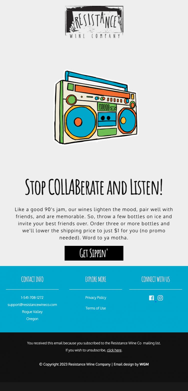
In keeping with the brand we resisted the traditional earthy colors chosen by many wineries. Instead we recommended bright, cheerful and youthful colors: grass, sunflower, robin’s egg…
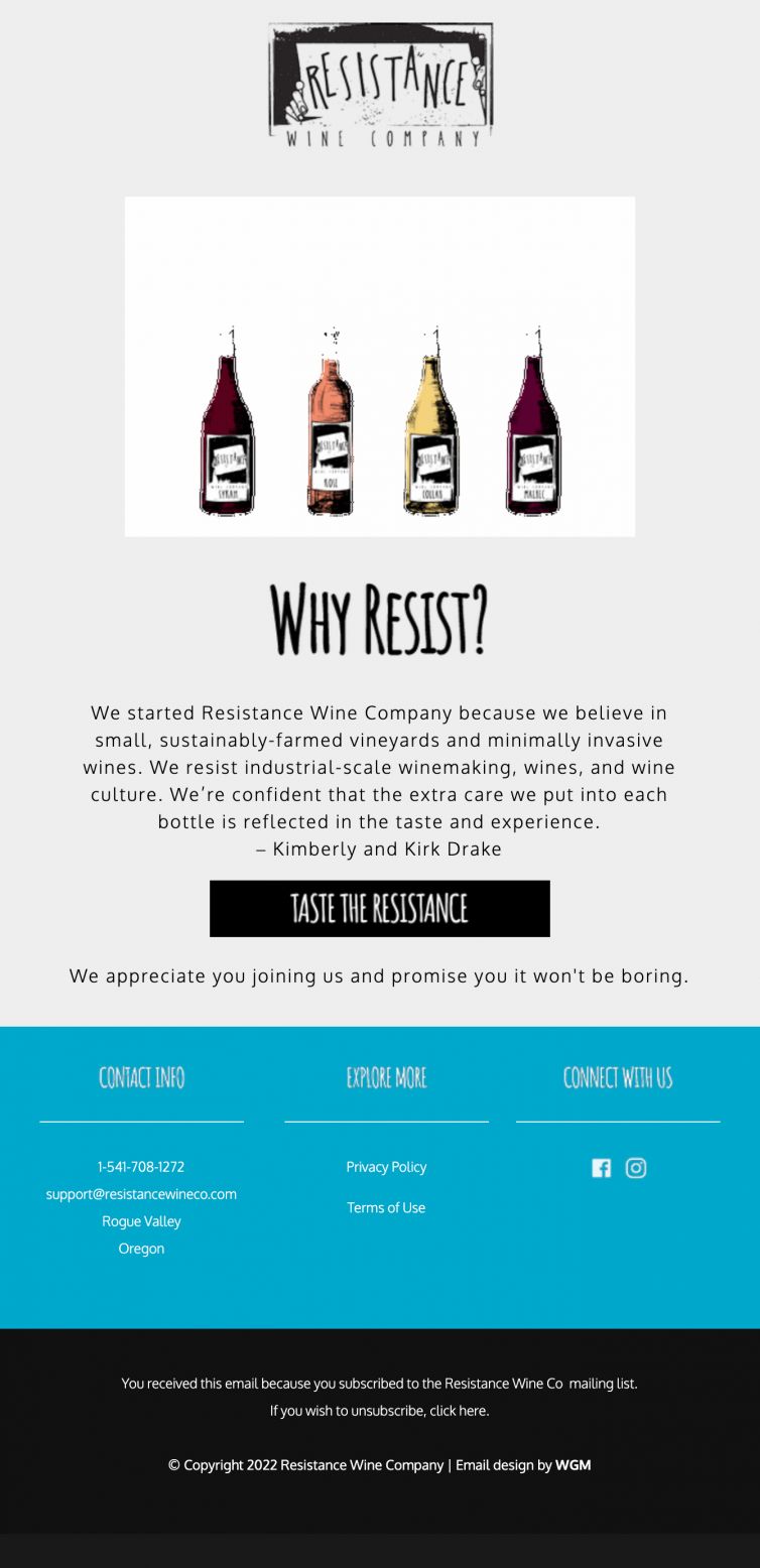
And we resisted the temptation of pristine bottle silhouettes and beauty shots. In their place we chose hand illustrated bottles which also lend themselves to fun animations for social media. All in all, we created a style guide that was simple and light-hearted, yet cohesively Resistance.
Website Design
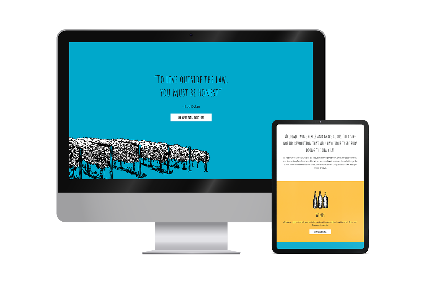
Based in the Rogue Valley, Oregon Resistance Wine Company was a nascent brand with no significant consumer audience, beyond friends and family. As their name suggests, Resistance had a mission. Overturn traditional wine culture conventions and craft healthier wines for people and the planet. The company was started by a husband and wife team who decided to resist corporate life to follow their passion, moving themselves and their young family from the east Coast to Oregon.
The challenge was simple and daunting at the same time. There were no brand or marketing fundamentals in place and Resistance’s husband and wife team needed to get on the same page regarding brand strategy, persona, tone and voice.

2023 Communicator Awards
Silver – Email (single) – Valentine’s Day
2023 Muse Awards
Silver – Email Campaign

2023 Davey Awards
Platinum – Social Media Campaign

2023 W3 Awards
Silver – Social Media Campaign


